

Launching SpiroKit for React Native

Today is the day! SpiroKit for React Native is finally available!
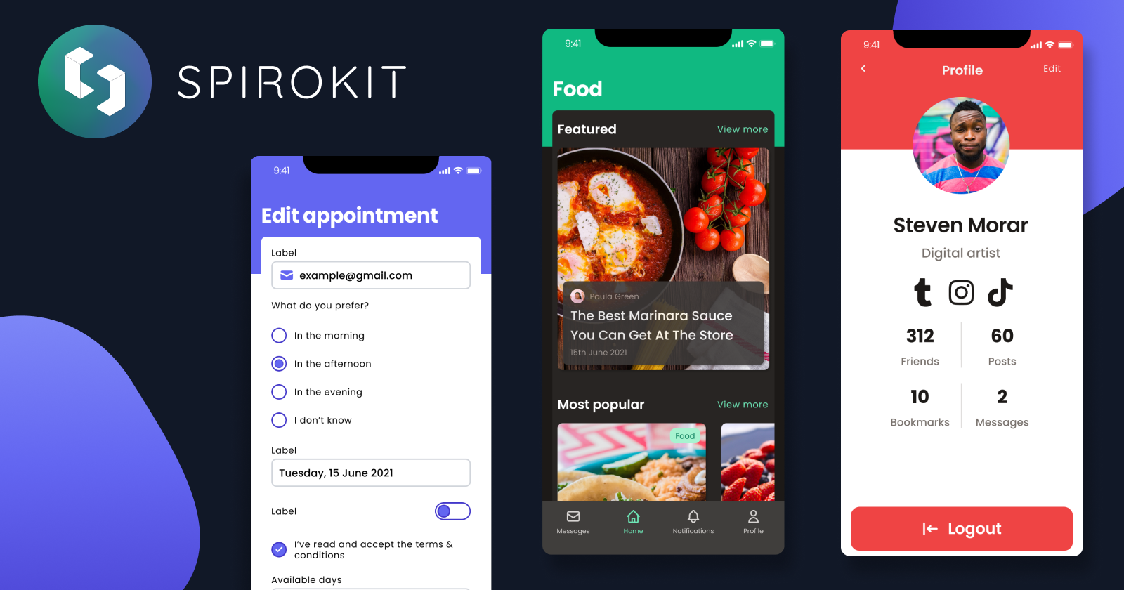
SpiroKit is a design system for mobile applications. It includes a collection of carefully crafted components and design principles to quickly transform an idea into a product.
You can quickly prototype using SpiroKit for Figma, and once your idea is validated, use SpiroKit for React Native to go from prototype to working demo in no-time.
Customizable
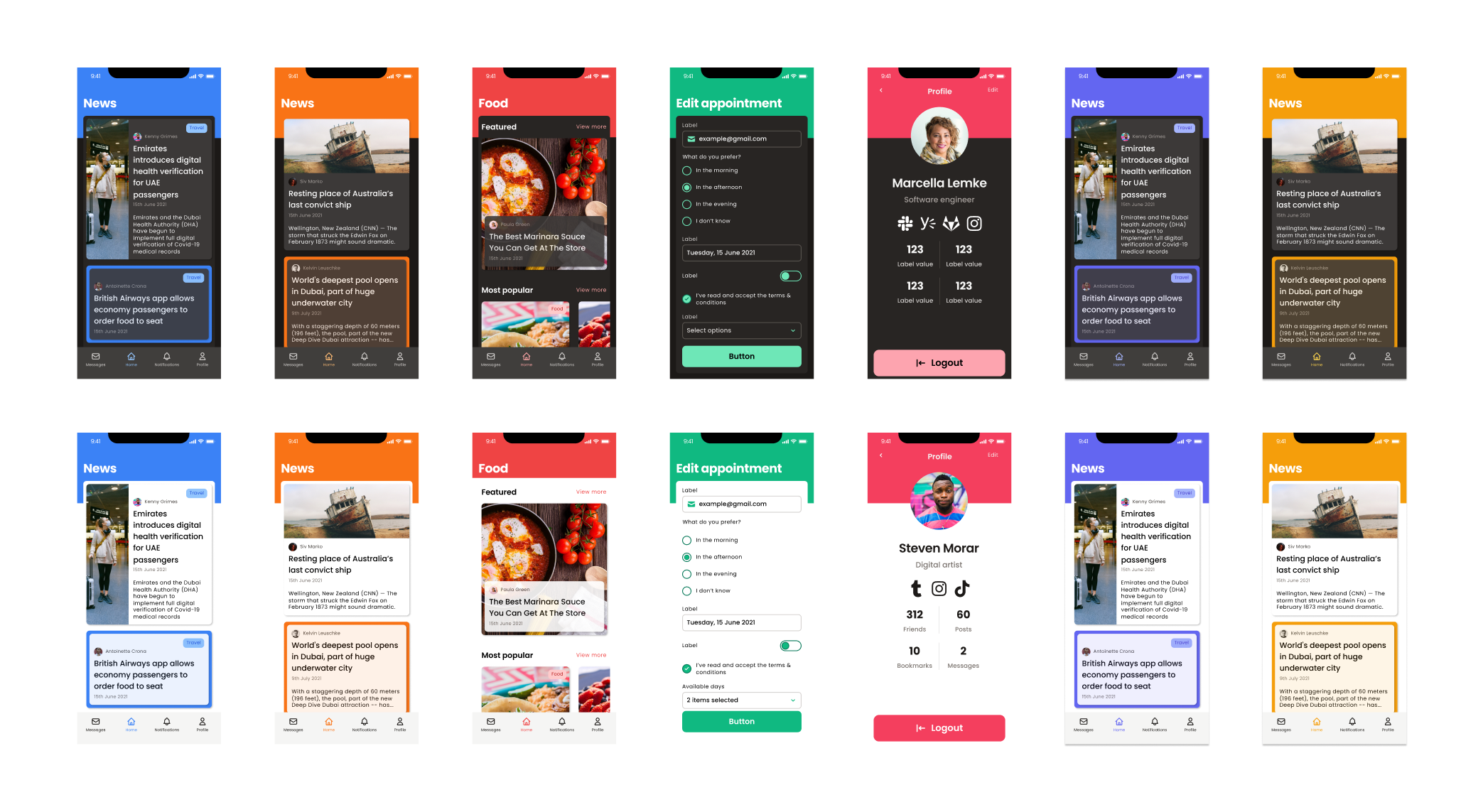
SpiroKit comes with a custom provider that allows you to set a global theme. It includes 17 different color palettes, and you can add your own if you want. You can also choose between light and dark modes and even use custom fonts.
Extensible
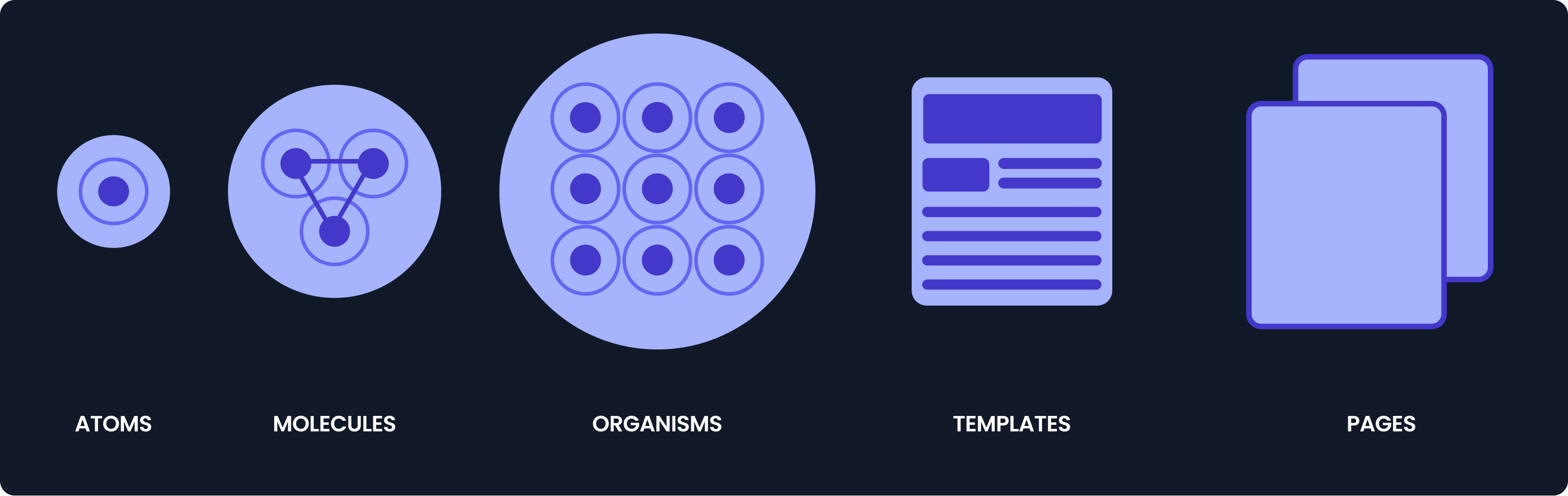 SpiroKit applies the atomic design philosophy, meaning that you can create your own components by mixing and matching the existing ones.
There are unlimited layout options by combining powerful primitives inherited from Native Base (Box, VStack, HStack, Center, etc.)
SpiroKit applies the atomic design philosophy, meaning that you can create your own components by mixing and matching the existing ones.
There are unlimited layout options by combining powerful primitives inherited from Native Base (Box, VStack, HStack, Center, etc.)
Great developer experience
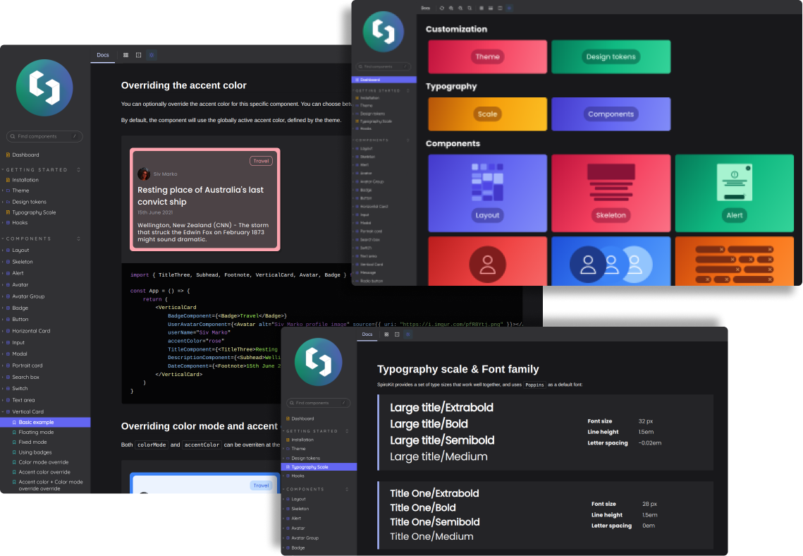 You get typing annotations, kickass documentation with everything you need, and tons of working examples to copy & paste. Also, we are currently working on a VSCode extension for code snippets so you can quickly scaffold any component.
Show me the code
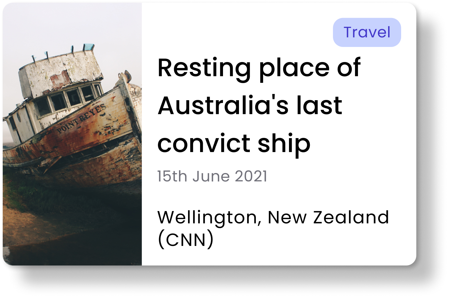
Here's an example of a card component. We rely on composition, so you have access to customize every detail.
<HorizontalCard
  BadgeComponent={<Badge>Travel</Badge>}
  TitleComponent={
    <TitleThree>Resting place of Australia's last convict ship</TitleThree>
  }
  DescriptionComponent={<Subhead>Wellington, New Zealand (CNN)</Subhead>}
  DateComponent={<Footnote>15th June 2021</Footnote>}
  AssetLeftComponent={
    <Image
      source={{ uri: "https://i.imgur.com/1lSpdz3.png" }}
      alt="Image of a ship"
    ></Image>
  }
></HorizontalCard>;
Result
Pay once; use it forever.
All our licenses include unlimited use. So you pay once and can use SpiroKit to build as many apps as you want. No limits.
We also support Parity Purchasing Power. Check our website to see if you are eligible for a discount.
Roadmap
App templates & more components
There are tons of new components coming soon, and we are also working on app templates, so you don't need to start your next app from a blank canvas.
Feature requests, feedback & public roadmap
To keep evolving SpiroKit with our community, we are working on a platform to centralize:
- Public roadmap
- Feature requests
- Feedback
More about this soon!
Resources
- If you are interested in getting your SpiroKit license, please visit our website
- Want to learn more about SpiroKit before buying? Visit our public documentation site
Comments
Join the discussionNo comments yet. Be the first to comment.


