Introducing "Theme Shifter"

SpiroKit v1 already included a set of powerful features that allowed you to customize your app. To name a few:
Choose between 17 pre-defined color palettes:
Add custom colors and use one of them as your primary color. e.g.: Using a custom "steelBlue" palette as the primary color:
Light and dark color mode
Accent color and color mode override at the component level:
- You can switch between light/dark or accent color at the component level by passing the
colorModeandaccentColorprops.
- You can switch between light/dark or accent color at the component level by passing the
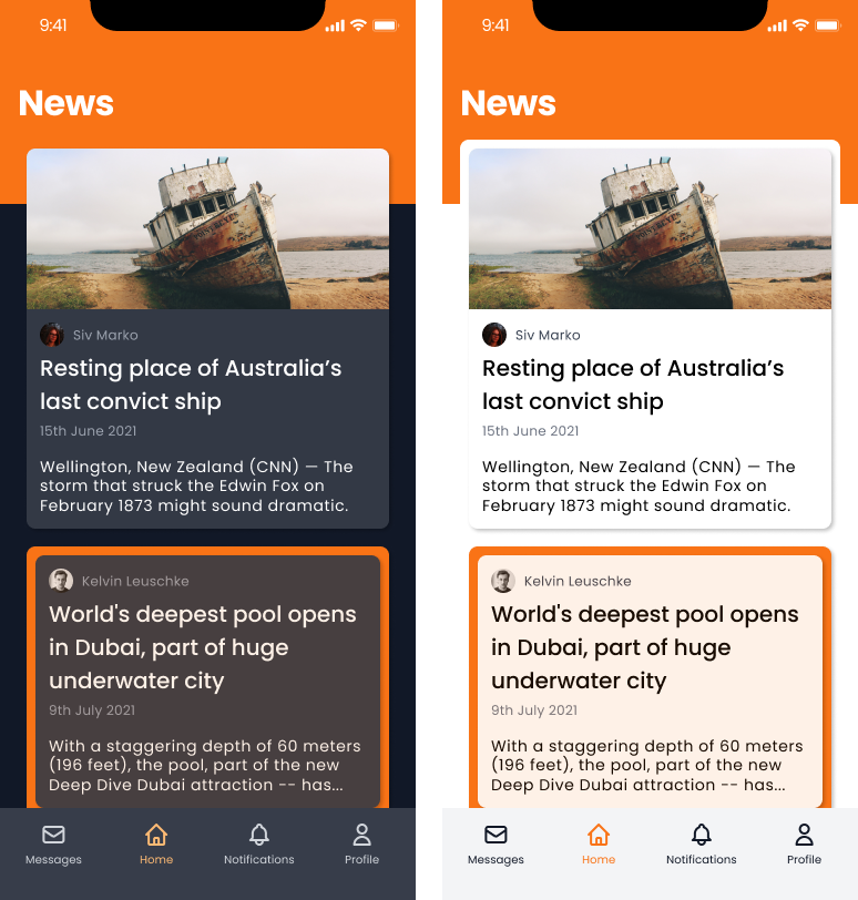
Switch between light and dark mode at runtime.
Those were great features, and it's probably enough for most cases, but I was missing something.
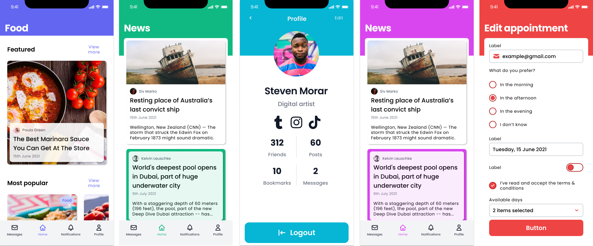
What if you want to switch the accent color at runtime and allow your users to choose the color they want? Or what if you want to override the color mode or accent color for a group of components without passing the props to each component? This is especially annoying when you nest components inside of a modal or action sheet.
Theme Shifter
Theme shifter is a new set of features, only available with SpiroKit v2, that will allow you to:
Switch between accent colors at runtime. This is especially useful if you want to allow your users to choose a custom color for the UI.
Apply a new color mode (light/dark) or accent color to a group of components.
Let's see this in action!
Switching accent color & color mode at runtime
The useTheme hook now allows you to make the switch and also get the current accent color and dark mode like this:
import { useTheme } from "@spirokit/ui"

const {
  accentColor,
  setAccentColor,
  colorMode,
  setColorMode
} = useTheme()

return (
  <VStack space="$2">
    <LargeTitle>You are using the {accentColor} accent color and {colorMode} mode</LargeTitle>
    <Button onPress={() => setColorMode(colorMode === "light" ? "dark" : "light")}>
      Toggle color mode
    </Button>
    <Button onPress={() => setAccentColor("emerald")}>
      Switch to Emerald theme
    </Button>
)
You can safely store your user preference and call the setAccentColor or setColorMode during startup 😉
Override accent color & color mode for a group of components
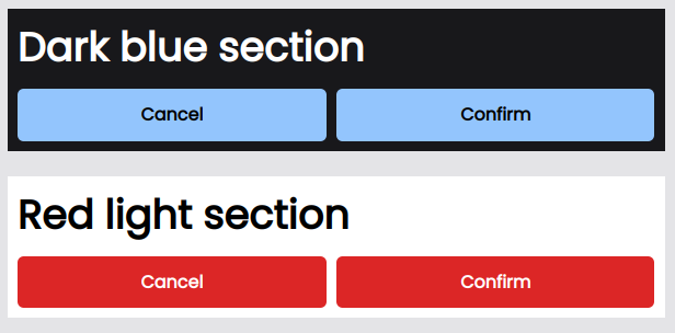
There's a new component called Theme. You can use it to wrap a group of components so they can inherit a new accent color or color mode:
import { Theme } from "@spirokit/ui"

return (
  <>
    <Theme accentColor="blue" colorMode="dark">
      <VStack padding="$2" backgroundColor={"$primaryDark.0"} space="$2">
        <LargeTitle>Dark blue section</LargeTitle>
        <HStack space="$2">
          <Button flex={1}>Cancel</Button>
          <Button flex={1}>Confirm</Button>
        </HStack>
      </VStack>
    </Theme>
    <Theme accentColor="red" colorMode="light">
      <VStack padding="$2" backgroundColor={"white"} space="$2">
        <LargeTitle>Red light section</LargeTitle>
        <HStack space="$2">
          <Button flex={1}>Cancel</Button>
          <Button flex={1}>Confirm</Button>
        </HStack>
      </VStack>
    </Theme>
  </>
)
As you can see in the image below, all 3 components are now inheriting the new preferences:
Start using these new features today.
If you are already using SpiroKit v2, run the
yarn upgradeornpm upgradecommand to get the latest version. The theme shifter functionality was added onv2.0.0-rc.15If you are using v1, I highly recommend you to upgrade to v2. I just published a comprehensive guide with everything you need to do.
You can also use our new starters for v2:
  # Starter with Expo SDK 49, Expo Router v2, TypeScript and SpiroKit v2
  npx create-spirokit-app@latest --template expo-template-typescript-v2

  # Web Starter with NextJS 13, TypeScript and SpiroKit v2
  npx create-spirokit-app@latest --template nextjs-template-typescript-v2
I hope you can enjoy using these new features! And let me know what you think.
Happy coding!